Custom dashboards
A drag-and-drop canvas of charts, maps, tables and alarm summaries, inspired by modern business intelligence tools — and, for anything people check repeatedly, a better instrument than a report.
Why a dashboard beats a report
A report is a snapshot of a period that has ended. It is produced, sent, read, and starts going out of date immediately — and when someone asks the obvious follow-up, the answer is next month’s report.
A dashboard is the same information, live. It answers the follow-up itself, because the reader can look again tomorrow and get today’s number. For anything checked repeatedly — network status, pump duty, catchment response, which sites are over a threshold right now — that is simply a better instrument.
Reports keep the cases where a fixed record of a period is the point: a submission, a board pack, an audit trail. Scheduled reporting covers those. Most other things are better as a dashboard.
Drag and drop, no development
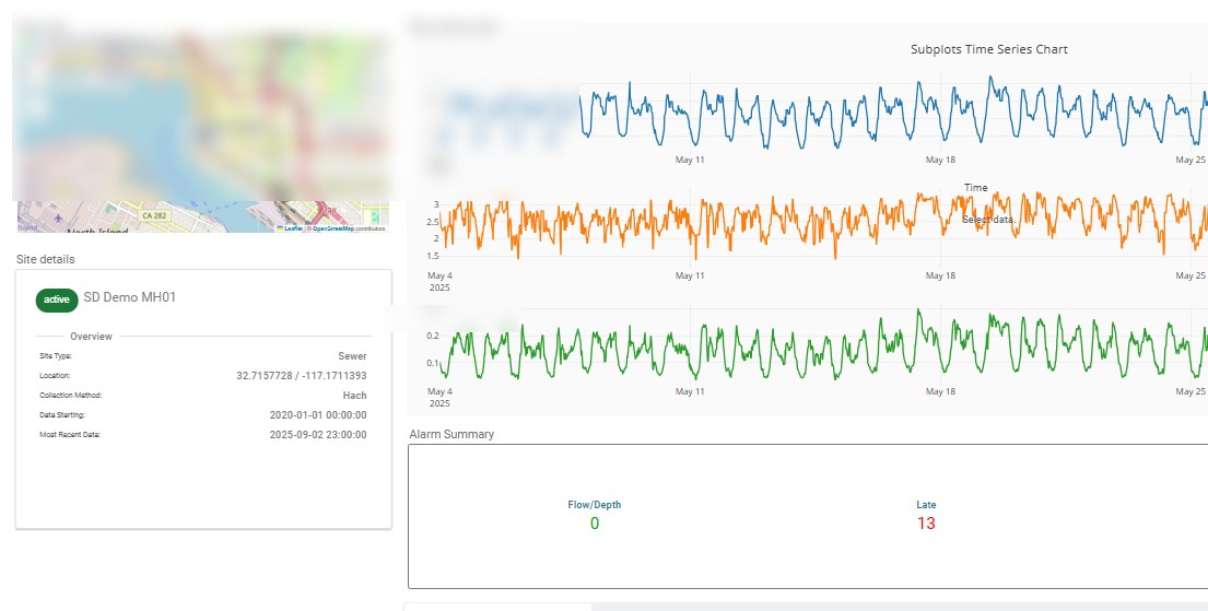
The builder is three panes. The Components panel on the left holds the widgets. The canvas in the centre is the workspace: widgets snap into place as you add them, and unlocking the dashboard lets you drag them around and resize them by their edges. The Global Settings pane on the right sets the mode, which sites are included, and the default date range — either fixed dates or a rolling period such as the last 30 days.
Users can pan, zoom, edit and share. Global date range = one time range applied to all widgets. Fixed or rolling date ranges set what is displayed by default. The "stays live in edit mode" point is dropped.
- Drag-and-drop canvas with snap-to-position widgets
- Dashboard Library for your own and group-shared dashboards
- Global date range: fixed dates or a rolling window
- Viewing interactions stay live whether or not the dashboard is unlocked
Six groups of widgets
Widgets are easy to add and arrange on the canvas.
Charts
Series and Scatter for time series and correlation, Gauge for a single current value, plus Site Activation Progress and Activation Status for tracking how much of a network is live.
Tables
Data Table for tabular values, and Network Table — which is the one operations teams tend to live in. See below.
Sites
An interactive map of site locations, which also selects which site the dashboard is showing.
Alarms
Latest Events, Events Count Card and Events Summary Card — alarm and event activity as a live panel rather than a separate screen.
Notes
Empty Note for free text, plus Site Details, Site Count Card and Site Summary Card for site-level information at a glance. Worth more than it sounds: a dashboard someone else will read benefits from a sentence explaining it.
Dates
One date range applied across every widget at once, so the whole dashboard moves together.
The table that shows you what you need to know
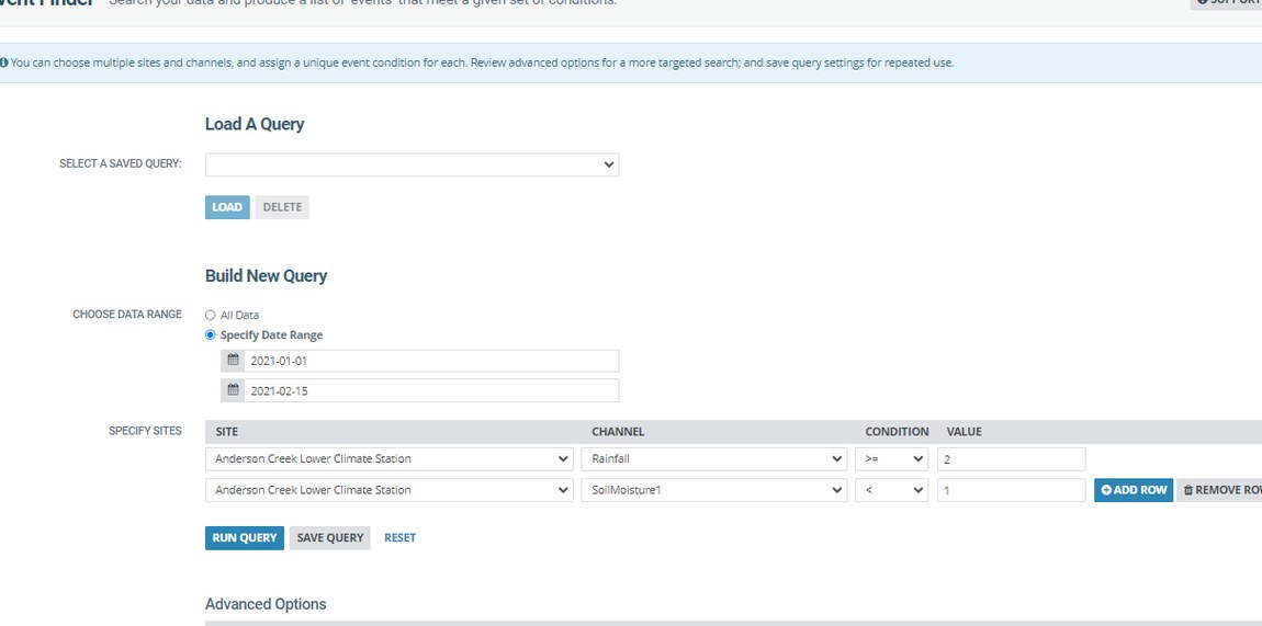
The Network Table filters your sites down to the ones meeting a channel threshold — only sites where depth is at or above 10 mm, say. So instead of a wall of sites you get the handful that currently warrant attention.
- Filter the network by a channel threshold
- Shows only the sites that currently meet it
- Click a row to open that site and channel in Graphing
- Particularly suited to operational monitoring
Simple or multi-site
Every dashboard runs in one of two modes, changeable at any time, and the choice decides how sites and channels behave across every widget.
Simple mode — aggregate
Combines the sites you have included into single visualisations, aggregating every site that shares a channel name — the sum of all Depth channels, for instance. Best when you want the network as one picture.
Multi-site mode — navigate
Widgets show the selected channel for whichever site is currently chosen, and the viewer picks sites interactively through the Map or a Site or Table Selector. Best when the job is to move between sites rather than total them.
A focused view, for people who do not live in the application
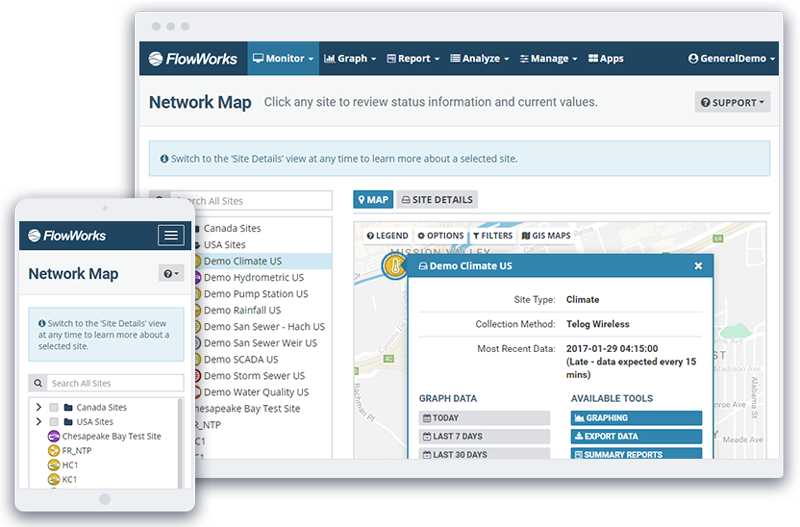
The value is that occasional users and stakeholders get a focused, easy-to-navigate view without having to learn their way around the full application. Someone who needs four numbers should not have to navigate a monitoring platform to find them — and in practice, that is how infinitii flowworks tends to spread through an organisation.
Viewing one still means signing in: either with a infinitii flowworks account, or with your organisation’s Microsoft 365 credentials. So a stakeholder can be given a dashboard without being set up as a full platform user, and the access stays governed either way.
Where the audience genuinely sits outside the system — the public, or another company’s software — the API is the right tool instead.
- Private by default; shareable with your security group or a named group
- Built for occasional users, not just daily ones
- A focused view rather than a tour of the whole application
- For audiences outside the system entirely, use the API
Related
Build one using your own data.
See how easy it is to share information.