Understand what is happening
The map, the graph and the dashboard — the three ways most people actually look at their data.
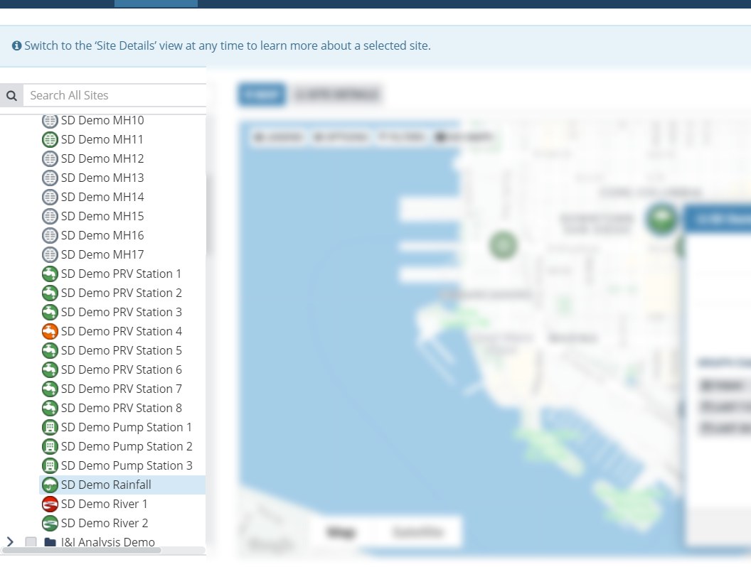
Every site, current, on one map
The GIS view shows every site in its real location with its present value and alarm state by colour. It is the entry point to everything else: click a site and you are in its detail view, with its channels, its history, its metadata and its recent alarms.
The ability to drill down to individual sites and channels, starting from a system view.
- Live status by colour, so an exception is visible without being searched for
- Site details — channels, history, photos, documents — one click from the map
- Filter by data collection method, so you can see what a particular logger fleet is doing
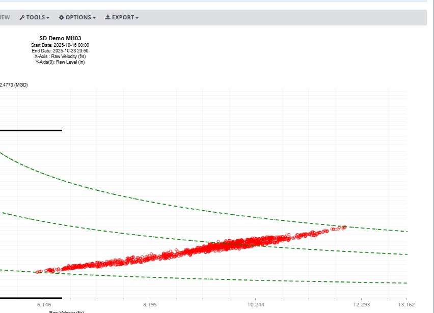
Time series, and what it correlates with
Graph any channel against any other, across sites, with templates you save and reuse rather than rebuild. Scatter plots with curve fitting quantify the relationship between two parameters — seven fits are available, of which Manning and Froude are specific to collection systems and the rest apply anywhere.
The pipe diagram overlay puts the scatter plot in the context of the pipe it came from, which is usually what makes a velocity outlier obviously real or obviously instrumental.
Photo channels appear on the same timeline, so a reading and the photograph of the site at that moment are on one screen.
- Multi-site time series with saved templates
- Scatter plots with seven curve fits, including Manning and Froude
- Pipe diagram overlay for level/velocity/flow scatter
- Photo channels aligned to the measurement timeline
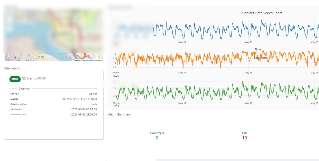
Built for the person who has to look at it
A dashboard builder along the lines of a business-intelligence tool: pick widgets, point them at channels, arrange them for the job rather than for the database. For anything people check repeatedly it is a better instrument than a report, because it answers tomorrow's question as well as today's.
The benefit is that dashboards can be set up for users with different roles or functions. Bullets use "created" rather than "arranged". ON DISTRIBUTION: everyone needs to log in, so everyone is a user — but a custom dashboard can be configured as the first page a user sees, which is what helps infrequent users.
- Widget-based builder, arranged per role or job function
- Distribute to clients and stakeholders who are not application users
- Custom real-time displays for a control room or a duty screen
In detail
Real-time monitoring
The live network view and site details.
Graphing
Time series, scatter plots, curve fits and photo channels.
Reporting
Turning the same data into something you can send.
Look at your own network
Maps and graphs are hard to evaluate from a description. A demo runs on your sites.