Real-time monitoring
Every site, its current value and its alarm state — on one map, without opening anything.
What it does
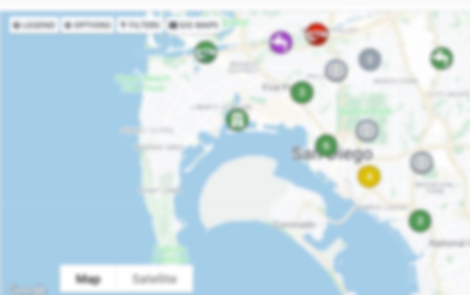
The network map is the entry point to the system. Sites appear in their real locations, coloured by alarm state, showing their present reading.
Clicking a site opens its detail view: its channels, its recent history, its metadata, its attached files and its alarm record. Filtering by data collection method lets you look at one group of loggers, or one telemetry type, on its own.
Data arrives in near real time from live-linked sources, so what you are looking at reflects the system now rather than the last time somebody ran an export.
- Live status by colour across the whole network
- Site details one click from the map
- Filter by data collection method
- Custom real-time displays for a control room or duty screen
Where this sits
Visualization
This capability is part of the visualization group.
All features
The other five groups.
Solutions
Or start from the problem instead.
See it on your own data
Feature lists are hard to judge. A demo runs on your sites and your history.